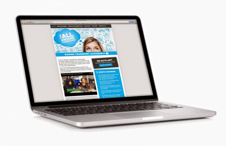
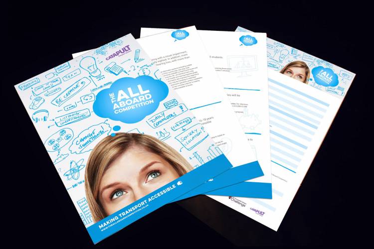
The competition is aimed at 14-18 year olds and challenges them to think of innovative ways to make bus travel easier for people with visual and hearing impairments. The competition is introduced through schools, so the brand needed to be swaggy (that’s slang for cool these days) to attract the students, but it also needed to be professional and educational to attract the teachers who will drive the competition forward, plus hinting at the TSC brand.
“That’s a lot of boxes to tick!” we hear you cry. Of course we managed to tick them all. The blue hints to the TSC corporate colour, coupled with the grey on the website creates a fresh and professional colour palette. The doodles reflect the exploration of ideas but are also inspired by the icons we used throughout the TSC IM campaign, and together with the “thinking head” they create a playful foundation for the competition.
Despite battling the countdown clock coding and entry form logistics, the website was up and running in time for the launch on the 24th October. You might have even spotted it on the ITV news, #totesamaze.
Our experience from one of our other school projects, “Lab in a Lorry” for the institute of Physics, really helped us to strike the balance between fun and education, “funducation” if you will.
Projects with tight deadlines have never scared us, and unless yours involves spiders or heights we’re unlikely to be phased! Quick projects are no different to any others; communicate, plan and then communicate some more.
Bless Up (that’s slang for goodbye…)*
*Other “hip” slang words you might like to try can be found here.

