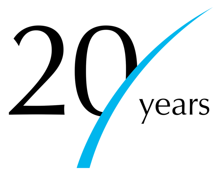
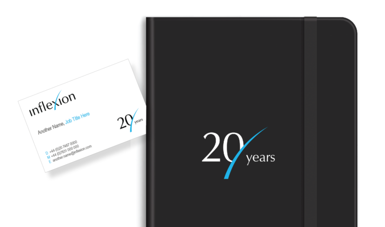
In recognition of achieving a key milestone anniversary, we were asked to create a logo to mark the celebration of 20 years of Inflexion. Our brief was that the mark would generally accompany the brand logo as an endorsement but should also in certain instances be allowed to shine in its own right.
The mark itself is a simple combination of the distinctive Inflexion forward curve and 20 years typography that eludes to new horizons and the future whilst still clearly representing 20 years of business growth.
The mark has been applied across business cards, literature and their website and will be applied across new materials as they are produced.
