
LifeArc, a leader in the life sciences sector, serves a wide spectrum of stakeholders including pharmaceutical companies, biotech firms, academic institutions, patient foundations, and the scientific community. In addition to appealing to these entities, the brand refresh needed to resonate deeply with the Board of Trustees and potential partners.
The creative idea – ‘bridging the gap’
We have completed lots of branding projects within the science sector, but it quickly became apparent to us that this organisation was different. Their USP is ‘bridging the gap between academic research and patient impact, translating scientific discoveries into healthcare applications such as therapeutics, diagnostics and scientific platforms. LifeArc are driven by ‘patient needs in underserved areas of clinical development’, such as microbial resistance, childhood cancer and rare diseases. Our idea was simple – we would communicate how LifeArc ‘bridge the gap’ starting with the logo itself.

A logo that reinforces the concept
Working in collaboration with the LifeArc brand team, the final execution of the logo is a visual metaphor for ‘bridging the gap’ between academic research and patient impact in its most simplistic form. It incorporates an ‘arc’ device as part of the brand mark representing a bridge. Using this as a starting point we created a whole suite of materials and ideas that also represented the idea of ‘bridging’ from one position to another.
Generating concepts that support the creative idea
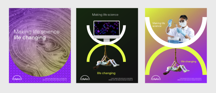
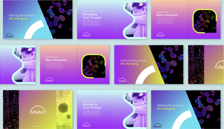
As well as the logo, other ‘bridging’ devices were developed and explored as part of the creative approach for the brand toolkit. Colour graduations were an incredibly simple tool to reinforce this, and we explored several palettes that would appeal to different audiences from youthful to academic, serious to playful. Imagery will also play a valuable role in ‘bridging the gap’, from gathering data-driven imagery to science research-based imagery.
.

Exploring the use of simple iconic shapes to convey complex messages
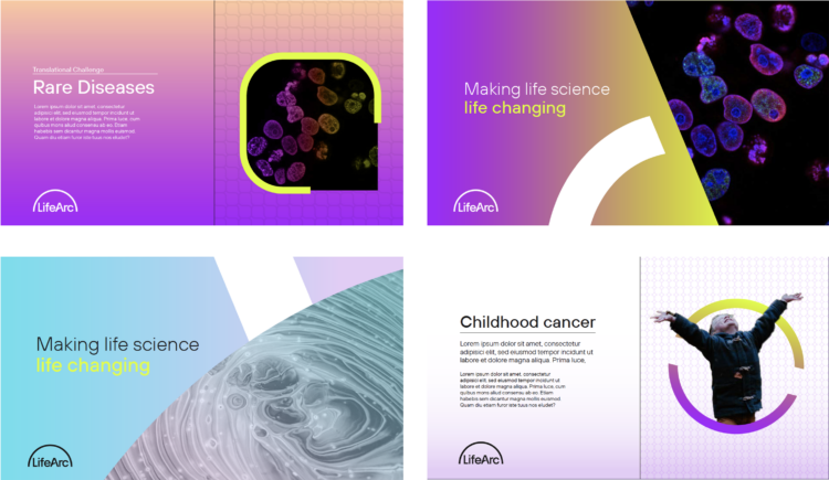
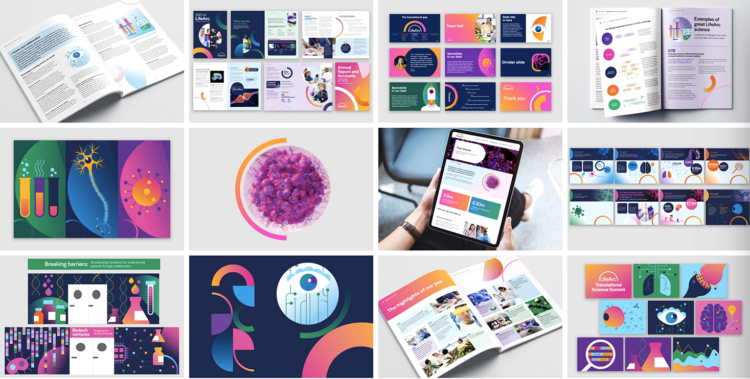
The ‘Arc’ of the logo is a device representing a process. (from one state to another). We looked at how other simplistic icons could be developed that cover LifeArc’s core activities and represent their 5 focus areas in healthcare (rare disease, global health, childhood cancer, respiratory infection and neurodegeneration). These concept icons evolved into pattern repeats, which can be used in the background and supported by a graduation, to reinforce the relevant subject matter.
![]()
Creating copy to tell a more engaging story
We worked with our copywriter Rupert Bradshaw to distil LifeArc’s complex strategy and messaging documents, down into a more simplistic, palatable story. When all these elements were combined, imagery, iconography, graduations, and messaging, they created a powerful and memorable concept.
.


The final brand execution
We worked very closely with the design and branding team at LifeArc to explore and convey how our ideas, concepts and logo exploration could be implemented to create a more dynamic brand that conveys LifeArc’s values and ambitions more clearly.
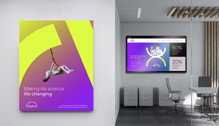
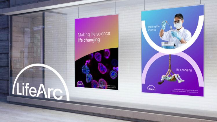
The final execution involved implementing our chosen logo route with some of the rationale, concepts, and tools we had explored with the brand team. These included the use of a vibrant colour palette and graduations to convey the idea of ‘bridging the gap’ from one state to another. Illustration was chosen as a key brand asset to provide more personality and enhance visual storytelling, where it was felt photography could not.
Michael Motskin, PhD, Marketing and Branding Director at LifeArc had this to say
To The Point’s creative vision and commitment have been instrumental in the successful rebranding of LifeArc, elevating our identity to match our ambition in medical research and innovation. Michael Motskin, PhD, Marketing and Branding Director at LifeArc