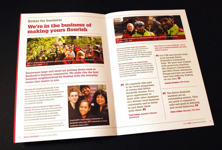
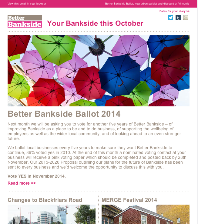
You may have noticed little splashes of magenta in our Enews and local area over the past couple of months. This has been our work for our local Business Improvement District (BID), Better Bankside’s 2015 ballot campaign. From a leave behind leaflet, a 2m high roller display to branding a bike, with the BID proposal brochure as the finale, we’ve been helping them to get their message out there.
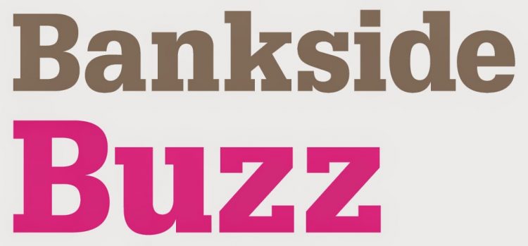
The upcoming ballot has also provided the perfect catalyst for positive change and an evolution of the Better Bankside’s sub brands – Visit Bankside, Bankside Venues, Bankside*, Bankside Buzz and Bankside Urban Forest. Each subbrand has a strong identity and personality that was beginning to appear distant from the Better Bankside brand and at ballot time it is essential that people know what the BID has delivered.
We started with a joint audit and rationalisation of their identity and communications, creating a clear and consistent brand hierarchy for the group. This enables us to clearly communicate the offerings and structure of the BID for their 2015 campaign, whilst building on the recognition of the main Better Bankside identity.
‘Bankside’ acts as the main connection in both location and the titles. Highlighting this was a core principle with the new visual language. Our work introduces the range of offerings all under the Bankside ‘umbrella’ and helps both businesses and locals to recognise the breadth and success of work completed by the Better Bankside team.
It was key to keep the main Bankside logo unchanged, as their colour palette and slab font are established and widely recognised. By retaining these two key elements, the design relies on clear and sympathetic typography to reinforce the hierarchy and distinguish the sub brands from the main identity.
Each of the campaign pieces followed this theme of clear, concise communication (great minds think alike!) using their bold recognisable colour palette and making use of strong imagery.
At the same time we challenged the volume of communications and looked at simplifying these to shorter more succinct pieces that linked through to the websites we had previously designed. Creating one simplified e-newsletter was the vehicle for this strategy. The template was built so Better Bankside can now create, edit and send their enews quickly and efficiently in-house. Check out their monthly updates here.

The culmination of this work is the ballot brochure that is hot off the presses and winging its way to all the Better Bankside businesses… of which we are one. You’re doing a great job guys, you’ve got our vote!

