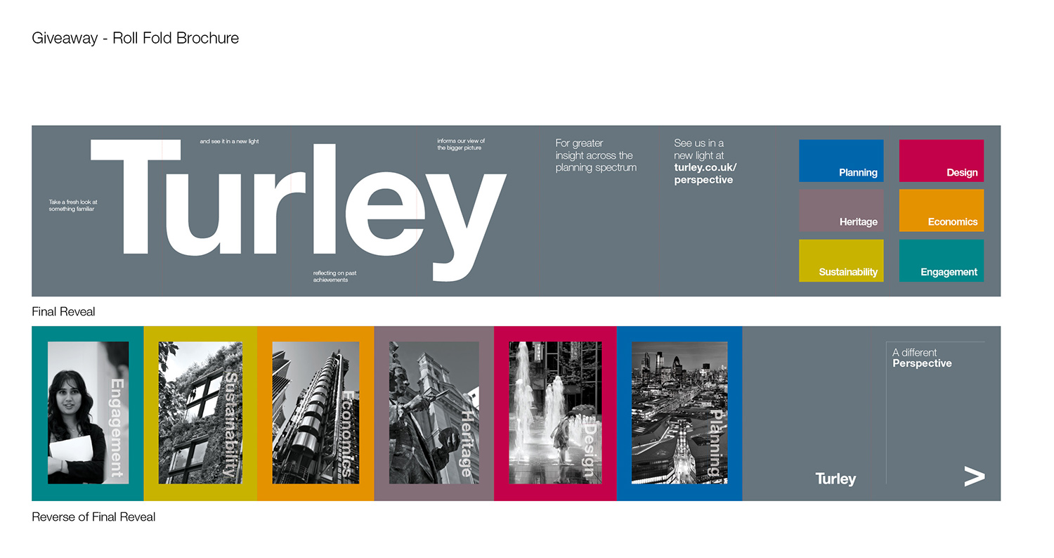
Last year we won a three way pitch to name and rebrand what was formerly ‘Turley Associates’, along with creating a launch campaign aimed at existing and potential new clients, which would raise awareness of the new direction the company was taking.
The original brief was to raise the profile of all their 12+ services, with the introduction of sub-brands, whilst retaining a ‘one company approach’.
“We challenged the brief at pitch stage, as we believed the two requirements were at odds with each other. Our recommendation was for a workshop with key decision makers to explore and address both the company structure and core messaging.” Explains Simon, our MD.
“We wanted to find out more about the people, culture and services as well as how their clients felt about the Turley brand before starting creative”.
Our approach to the tender (which didn’t include creative) was liked, and the workshop was commissioned, along with a series of telephone interviews with key clients. The report outlining our findings, from the interviews and the key outcomes of the workshop, steered the project in a new direction.
“The session lasted a full day, and was pretty full on! Everyone got involved which was brilliant, plenty of lively debate and interaction with key directors and service heads.” Recalls our Creative Director, Kevin “We were able to refine the 12+ services to a core of six, with the remaining ones being categorized as support services to this core.”
The final report recommended a more subtle approach to sub branding of the six services and an evolution of the Turley Associates logo, dropping the Associates and refining the logotype to a more simple yet sophisticated mark. A visual language, which included colour coding, supported this approach.
“The aim was agreed as repositioning ‘Turley’ as a bold, forward thinking, creative planning company whose huge depth of knowledge across its six core services [planning, design, heritage, economics, sustainability and engagement] provides added benefit and insight for their clients.” notes Simon “The website was already underway with a separate digital agency as the rebrand started, however tothepoint worked with their web team to ensure the new website was on brand for the new look Turley.”
The rebrand was communicated with a launch campaign entitled ‘A different perspective’, which not only introduced the world to Turley’s new look but also reminded people of the knowledge and insight they provide to clients. We developed the theme and applied the creative across various materials, from literature, an email campaign and press advertising (including Estates Gazette, Property Week, Planning and Retail Week ) to a promotional launch video.
To make sure the new brand maintains consistency a set of thorough guidelines where produced, demonstrating brand usage and this has been supplied with a range of indesign and word templates. This toolkit helps Turley’s in house design team to implement the huge volume of materials they need to generate on a daily basis, efficiently and consistently.
“Tothepoint has done an excellent job, first in teasing out the right brief and then in bringing our visual representation up to date, clarifying our offer and developing our messaging. Early feedback from across the company, and outside, has been great and we look forward to rolling out our new branding and offer over the coming months.” Says Mike Best, Executive Director at Turley.
The brand and website are now live – with the rest of the collateral being rolled out over the next few weeks.


